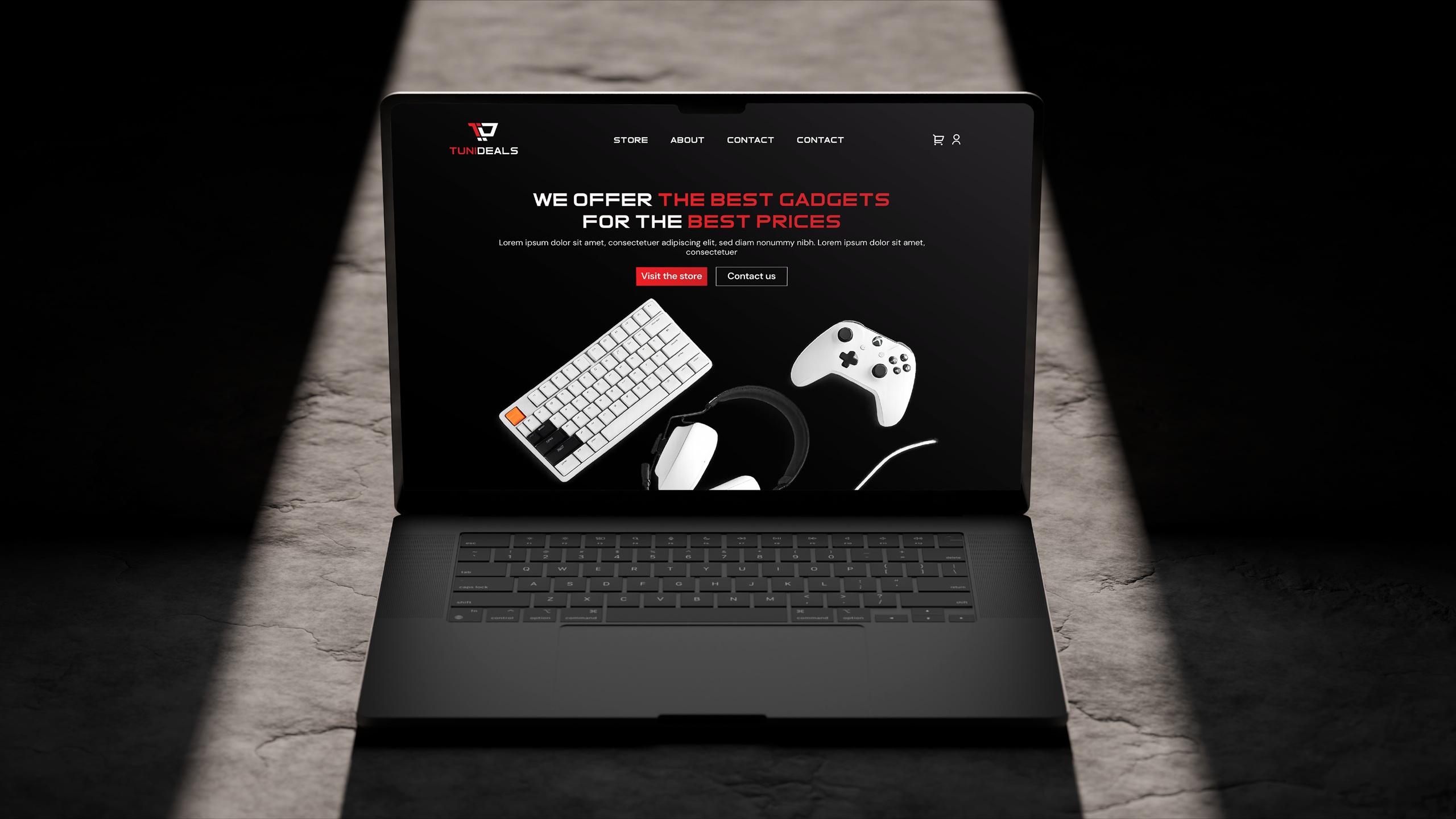

TuniDeals entered a crowded high-tech market with a powerful competitive advantage: direct import and aggressive pricing. However, without a visual identity, they risked being perceived as just another “budget” reseller. The goal was to build a brand that looked premium, trustworthy, and technologically advanced from day one.
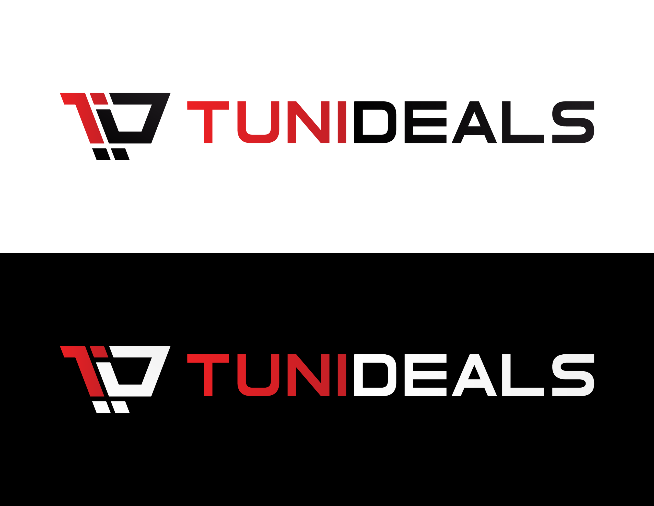
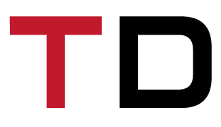
Strategic Naming: We developed the name TuniDeals (Tunisia + Deals) to instantly communicate local roots and market-leading value.
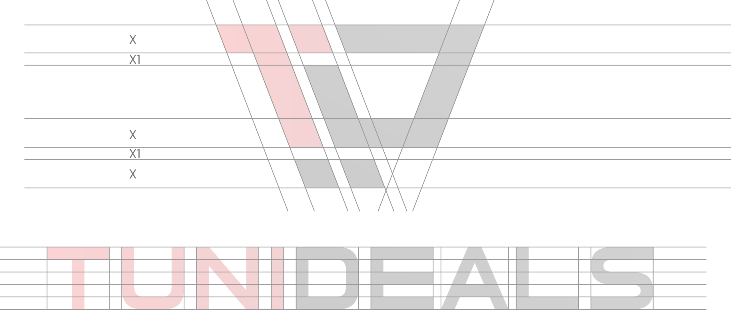
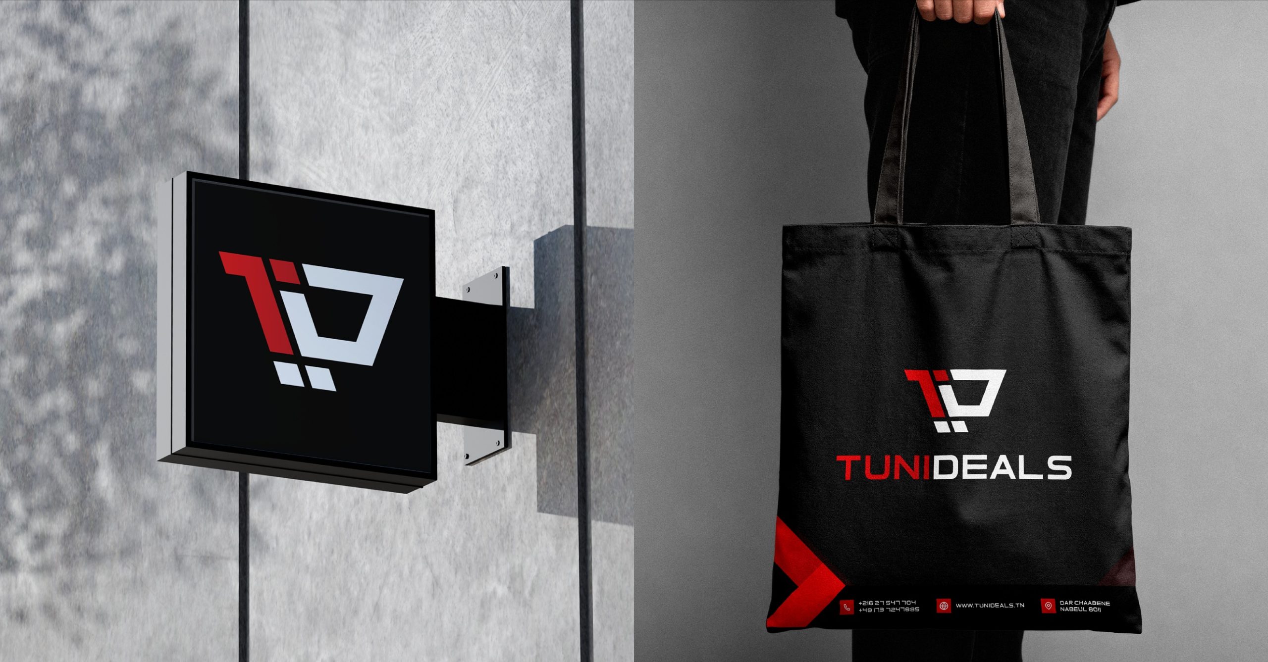
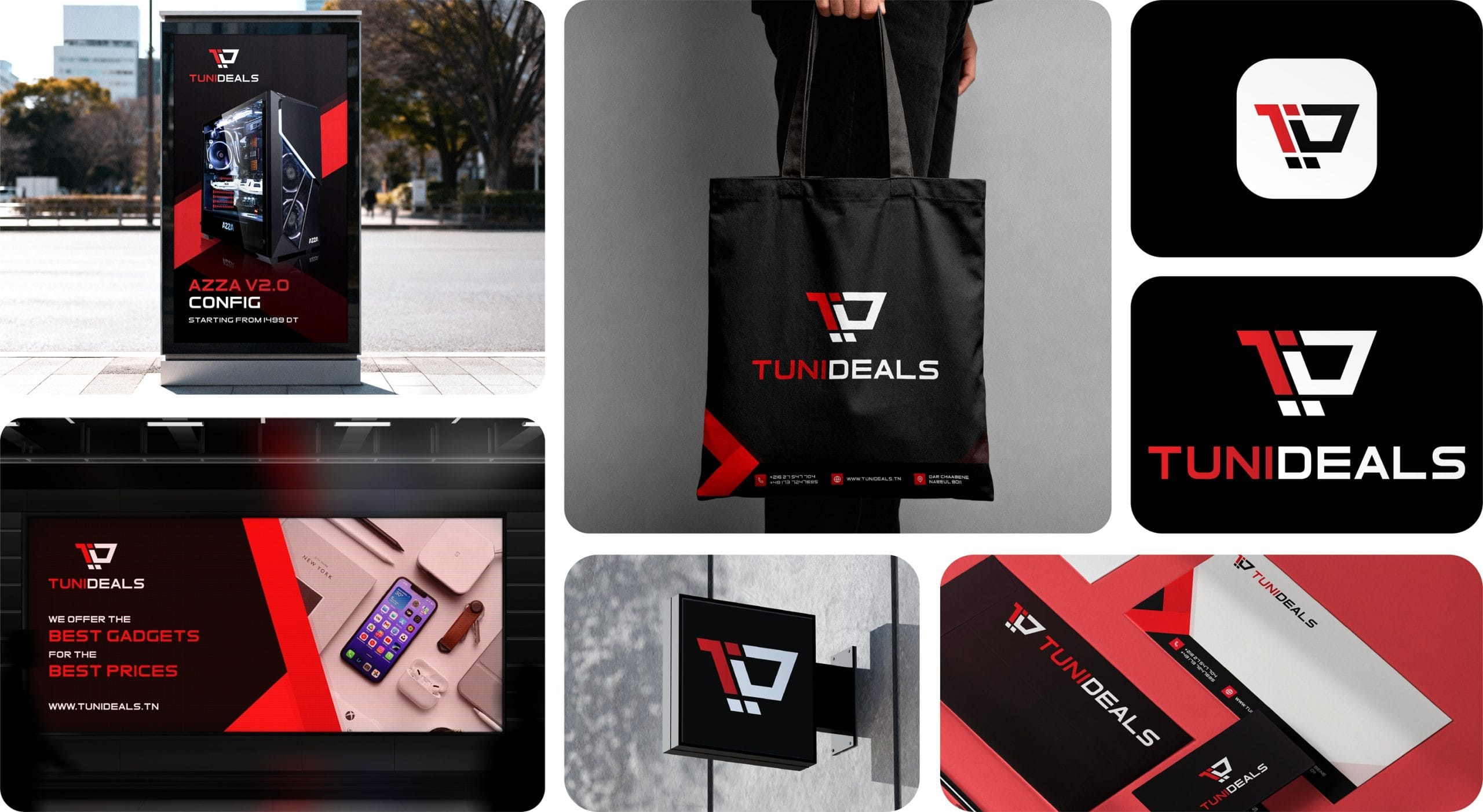
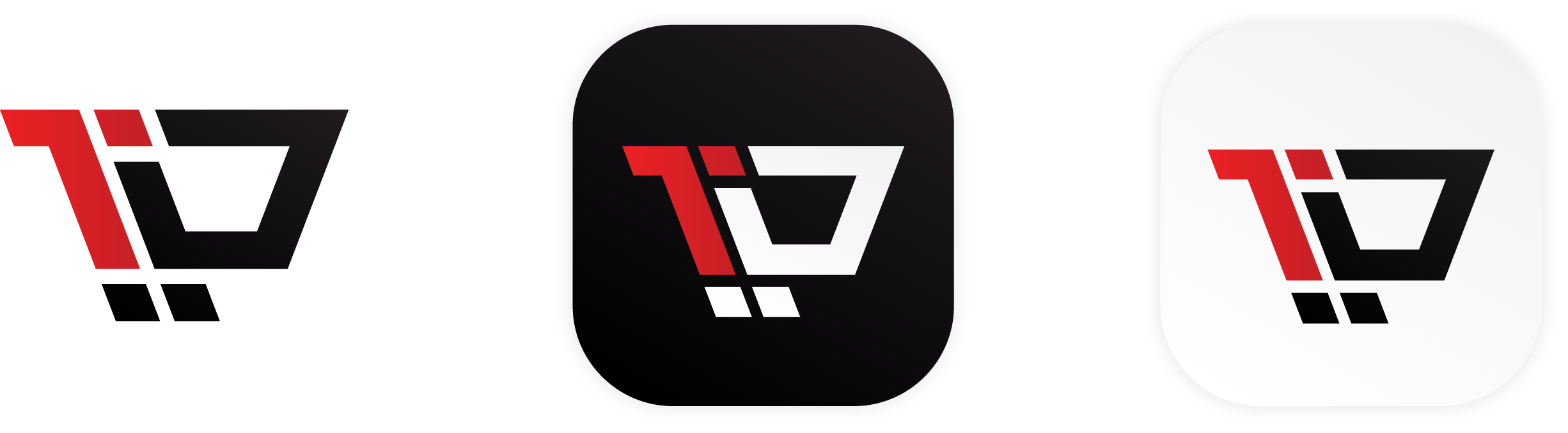
The Symbol: The icon is a geometric fusion of the letters ‘T’ and ‘D,’ engineered to form a minimalist shopping cart. This represents the seamless transition from “browsing” to “owning” high-end tech.
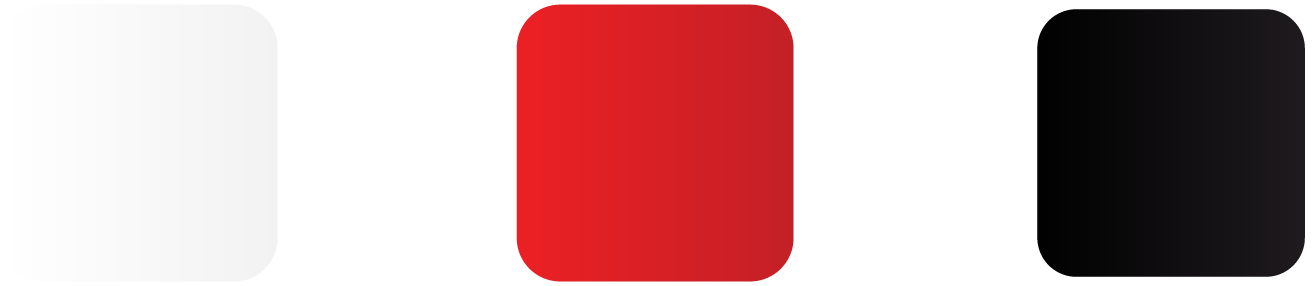
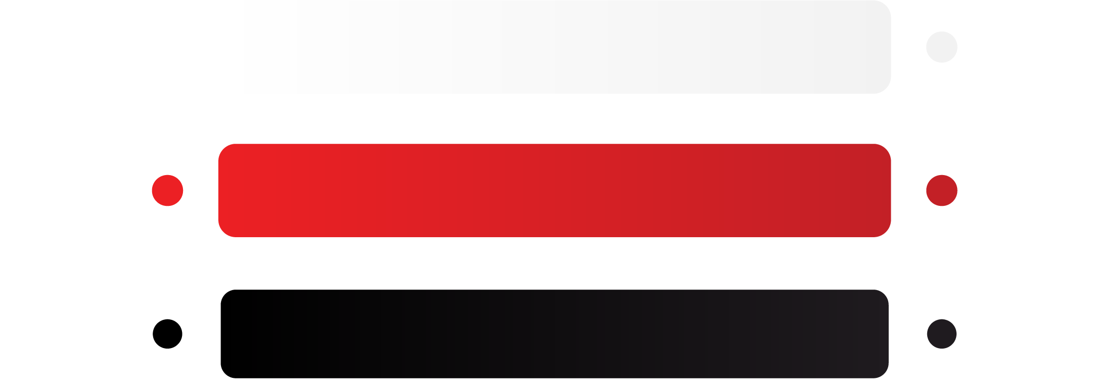
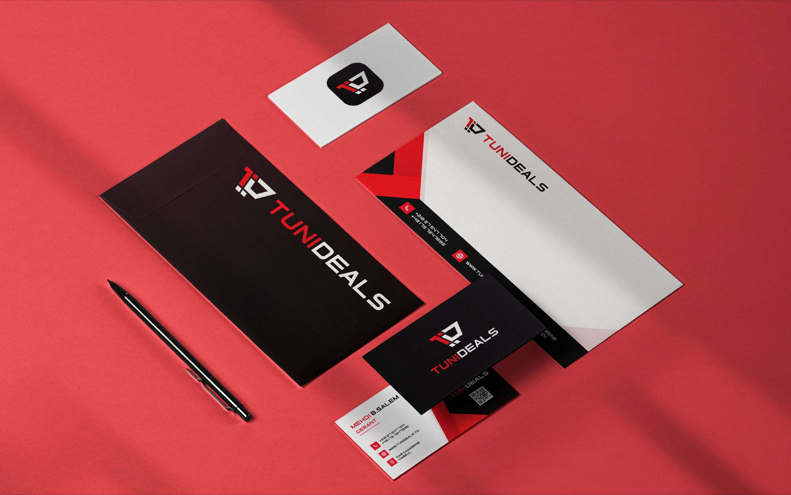
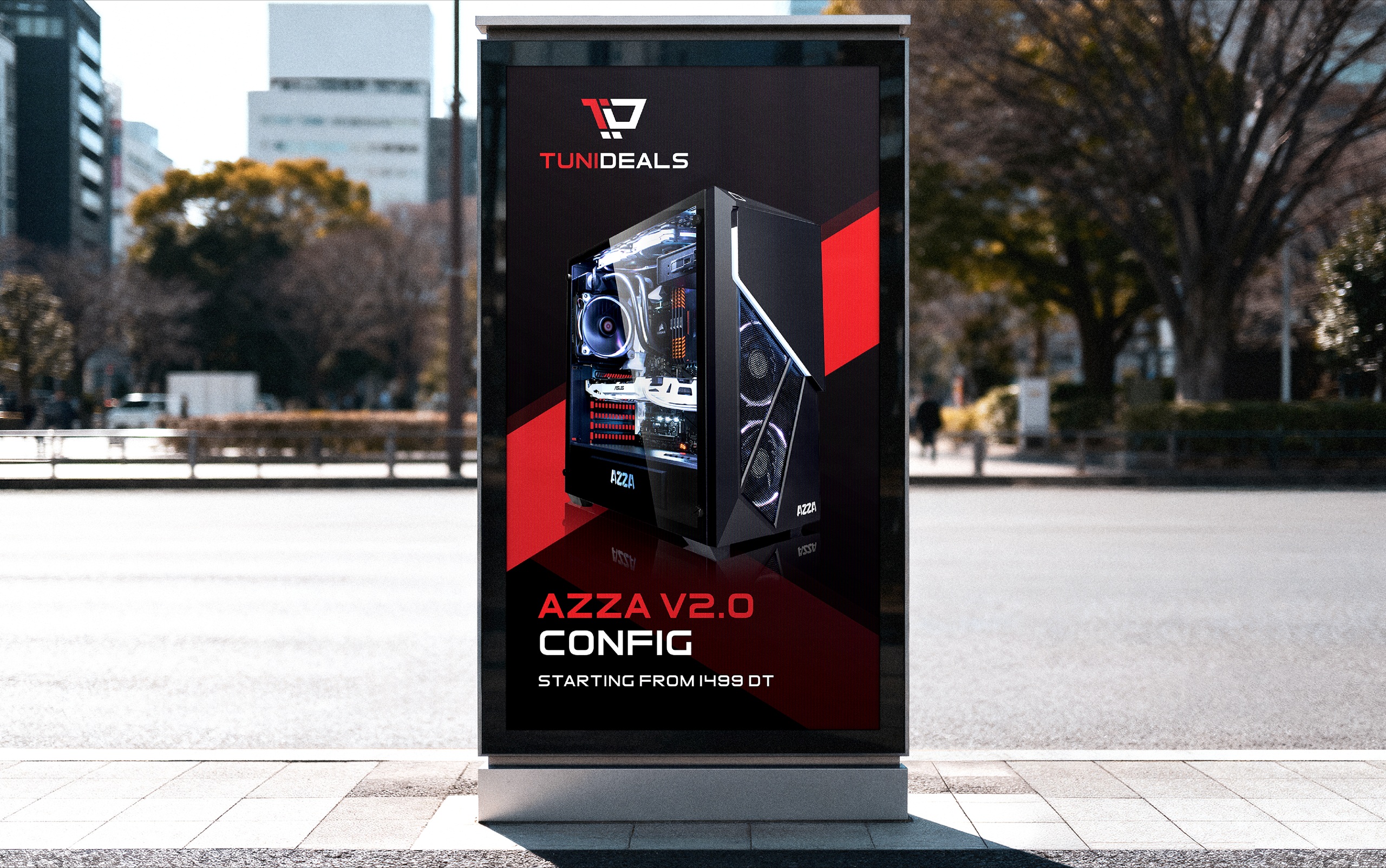
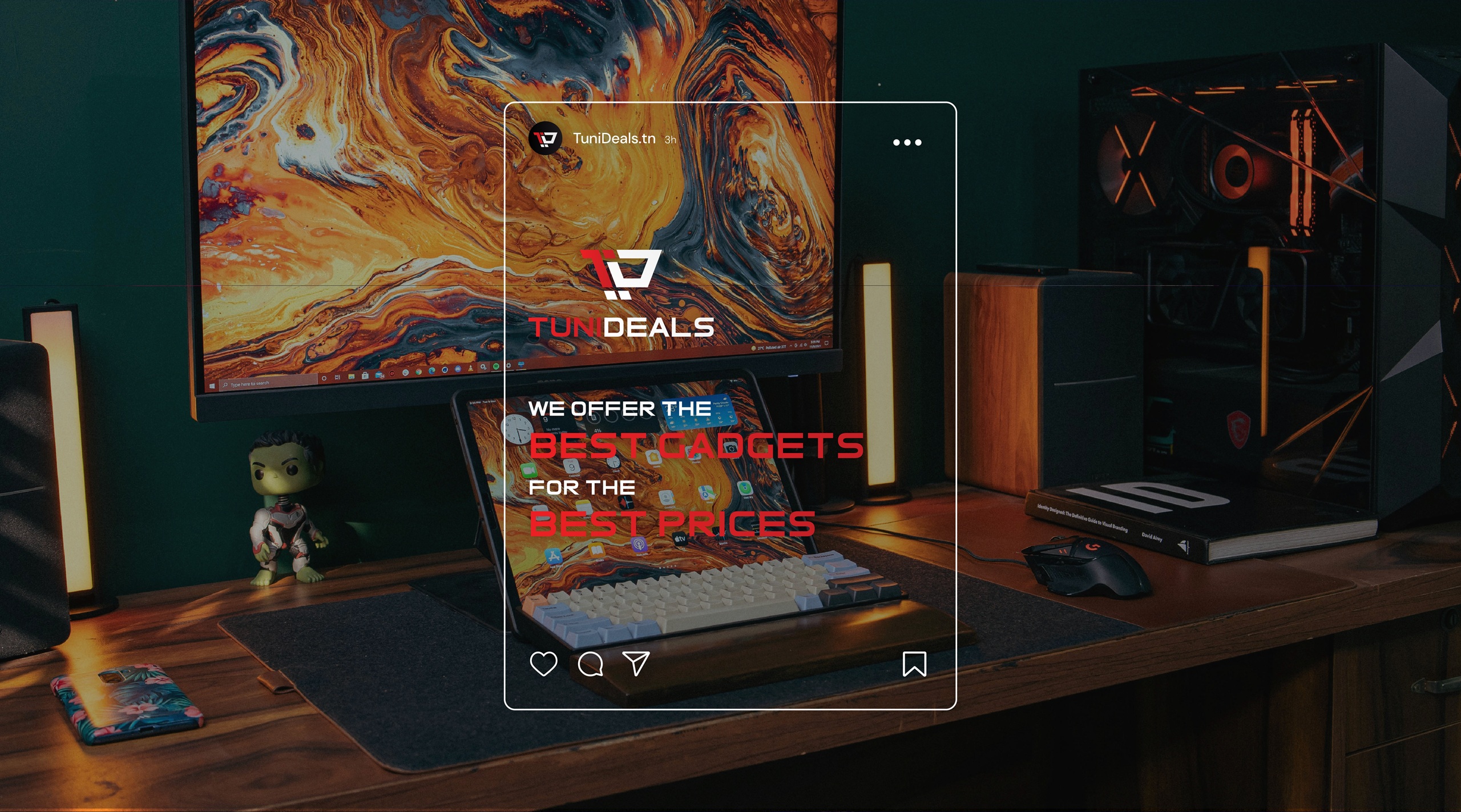
Color Narrative: We utilized a high-contrast palette of Power Red, Deep Black, and White. This not only evokes the Tunisian national identity but also mimics the visual language of high-performance tech and gaming industries.
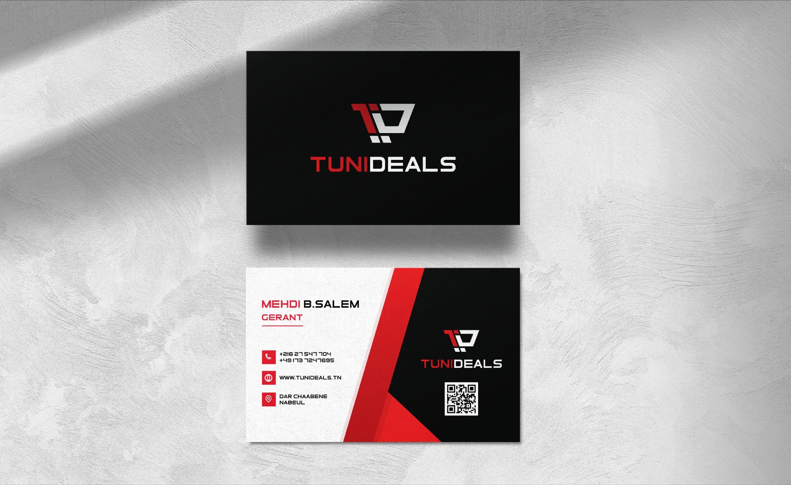

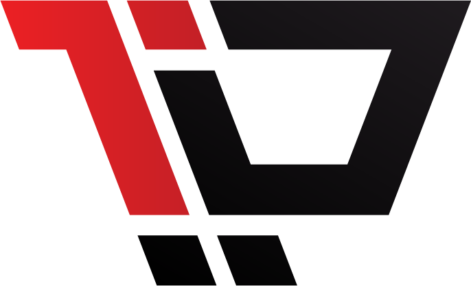
The Concept: The TuniDeals icon is built on utility rather than decoration. By merging the ‘T’ and ‘D’ into a single geometric unit, we created a symbol that functions as both a brand signature and a literal shopping cart. It is a direct visual shorthand for tech commerce, designed to be as efficient and precise as the hardware the company sells.

Initials of the brand’s name “TuniDeals”
The “T” letter is kept in red to reflect the color of the tunisian flag.

The synergy of the elements results in a minimalist shopping cart. It serves as a powerful visual metaphor for the brand’s retail vocation.

The Foundation:
A national Identity as a trust Anchor : The palette is a direct reflection of the Tunisian national flag. By utilizing Red and White, we established an immediate cultural connection with the local market. This choice bypasses the need for introductory trust-building; the colors signal “local expertise” and “national pride” from the first touchpoint.
The Red Gradient: Volumetric Power:
The red elements utilize a subtle linear gradient that transitions from a vibrant Power Red to a deeper, more saturated tone. This is not purely aesthetic; it creates tonal depth. It prevents the icon from appearing as a flat graphic, instead giving it the weight and presence of a physical tech component.
The White Gradient: Hardware Gloss:
The “white” sections are not a flat hex code. We implemented a micro-gradient moving from pure white to a very light silver-grey. This mimics the way light hits premium plastic or brushed metal surfaces. This subtle “gloss” effect reinforces the brand’s positioning as a retailer of high-end, sophisticated technology.