Project’s name : Orbata Trading Export (OrbaTrEx)
About :
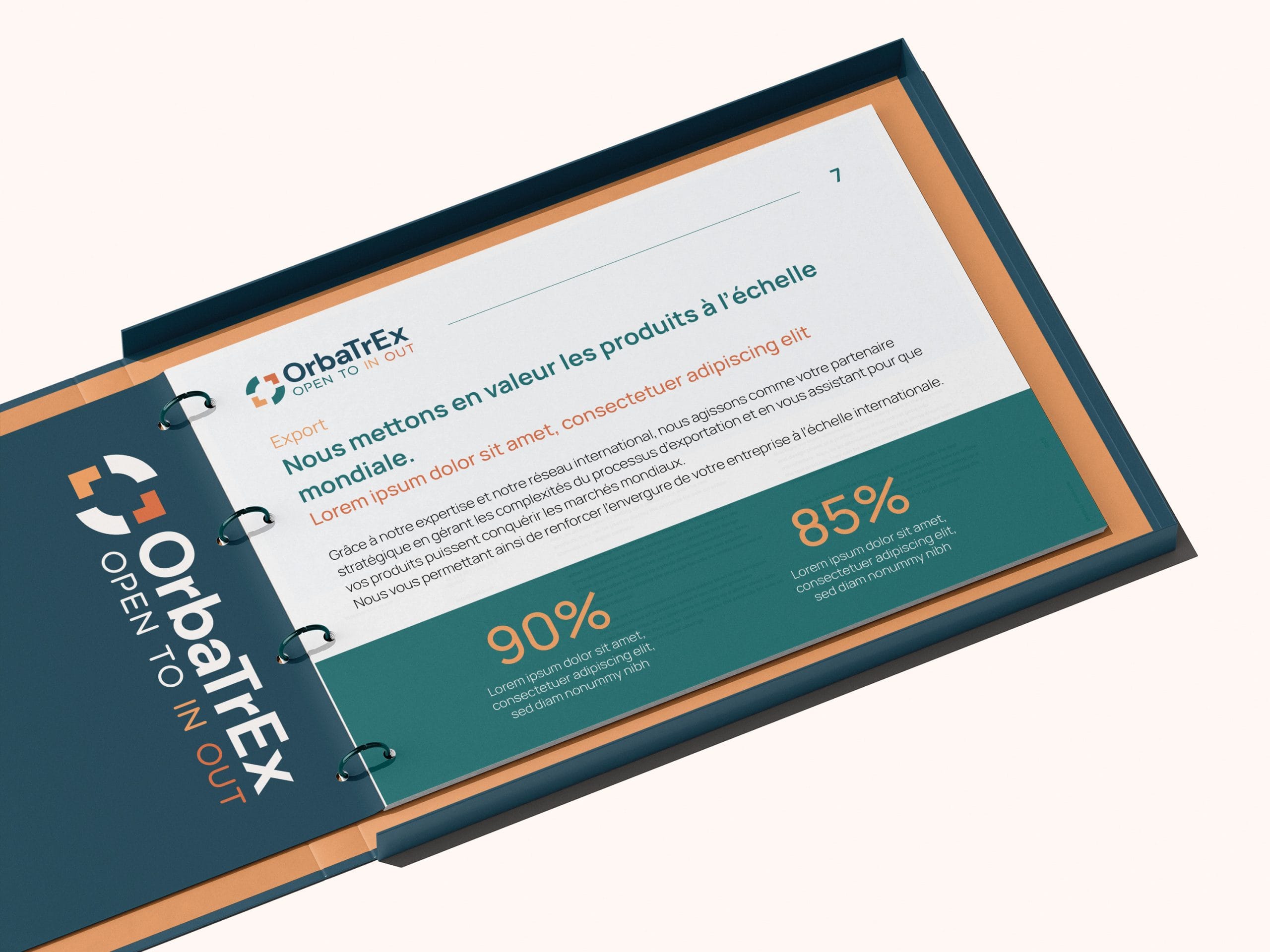
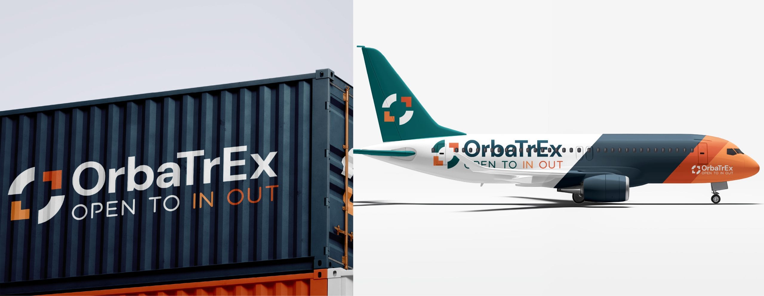
OrbaTrEx is a Tunisian international trade firm acting as a strategic bridge between local markets and global opportunities. Specializing in “Made in Tunisia” exports, brokerage, and logistics, they operate under the slogan “Open to In Out.” They partnered with our agency to build a professional brand foundation from the ground up.
The Challenge :
As a new player in the high-stakes global trade sector, OrbaTrEx needed to establish immediate authority and international trust. The primary creative hurdle was to translate the “In/Out” movement of their slogan into a modern visual identity that felt sophisticated and reliable rather than cluttered.
The Solution :
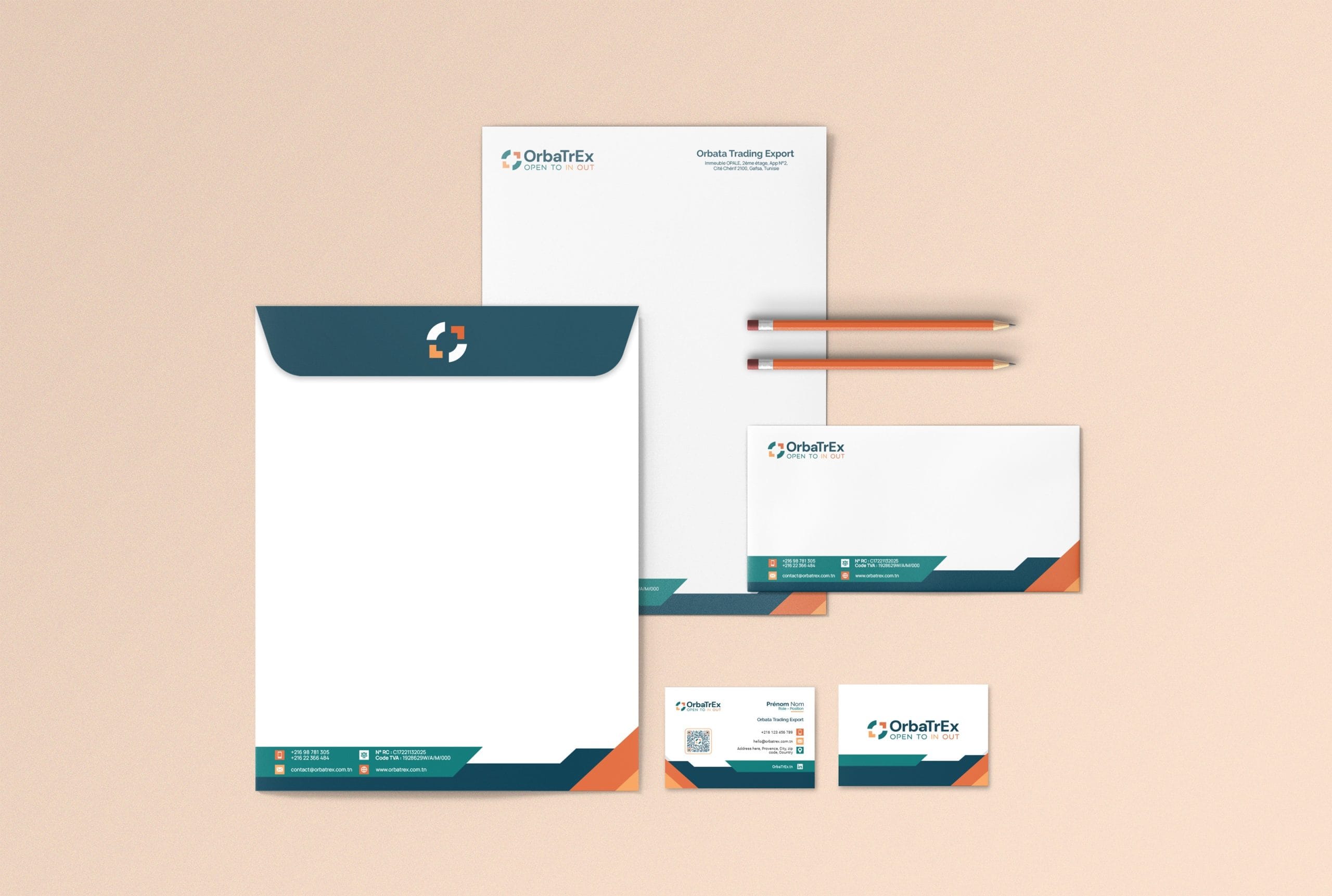
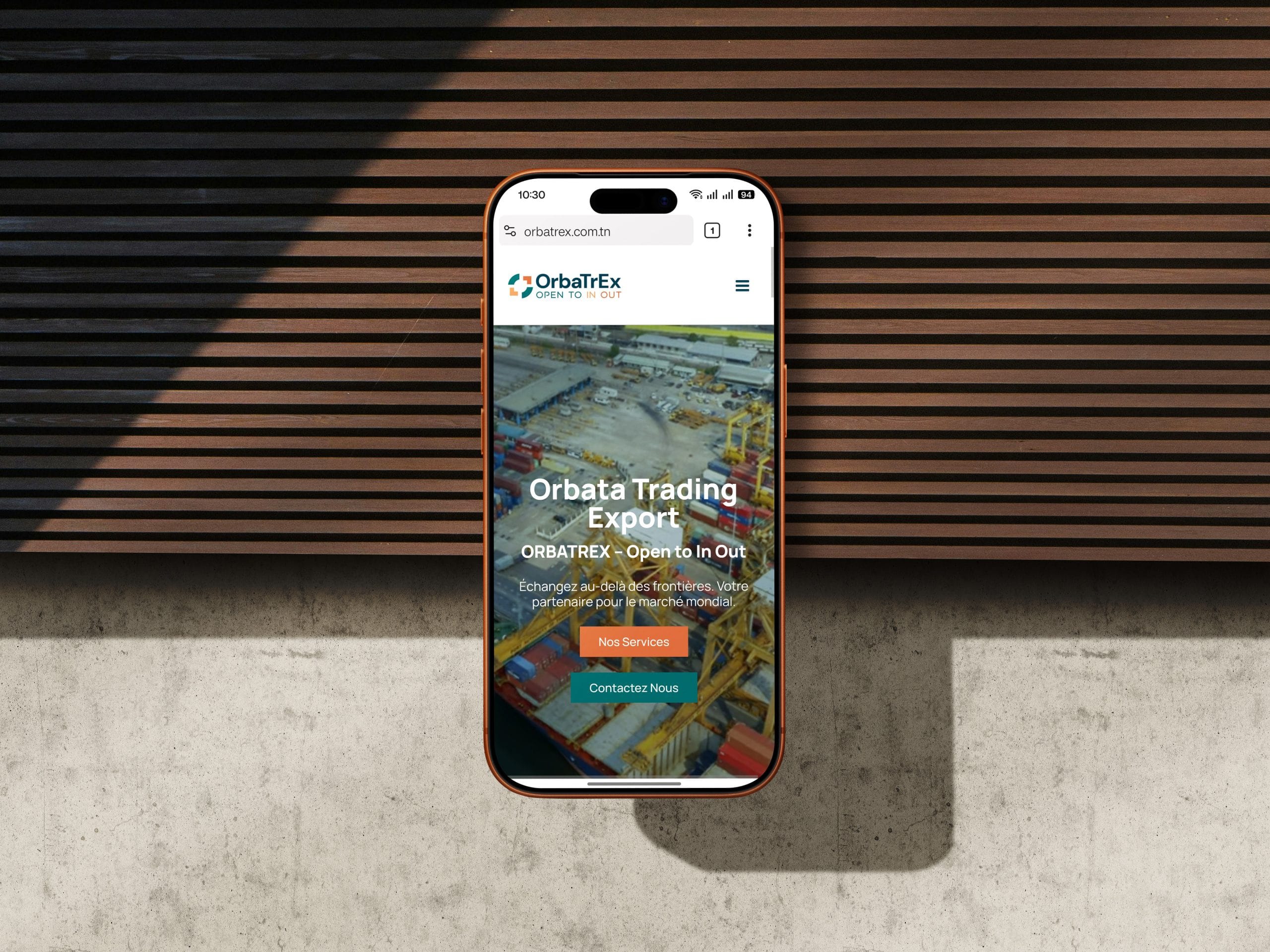
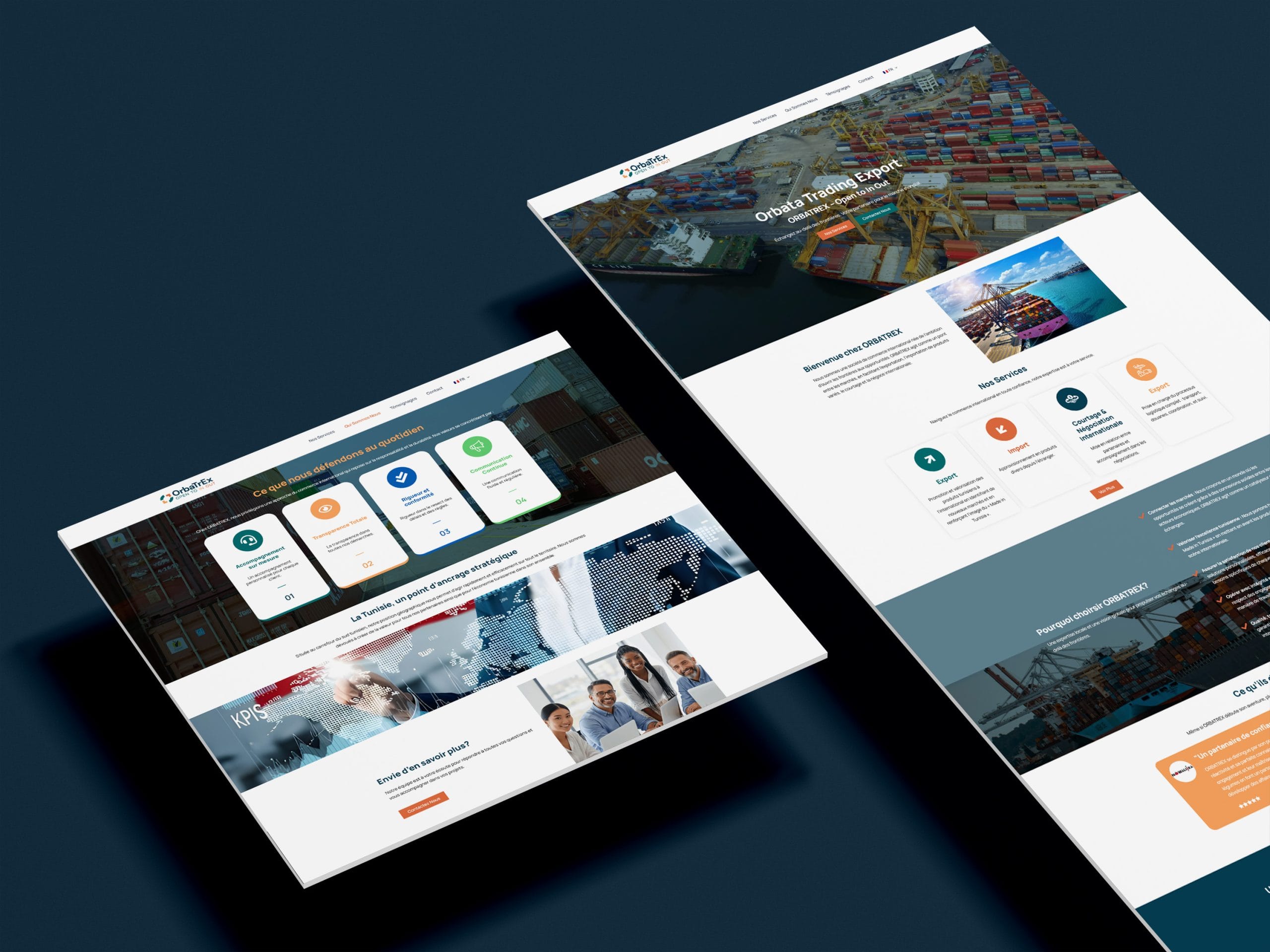
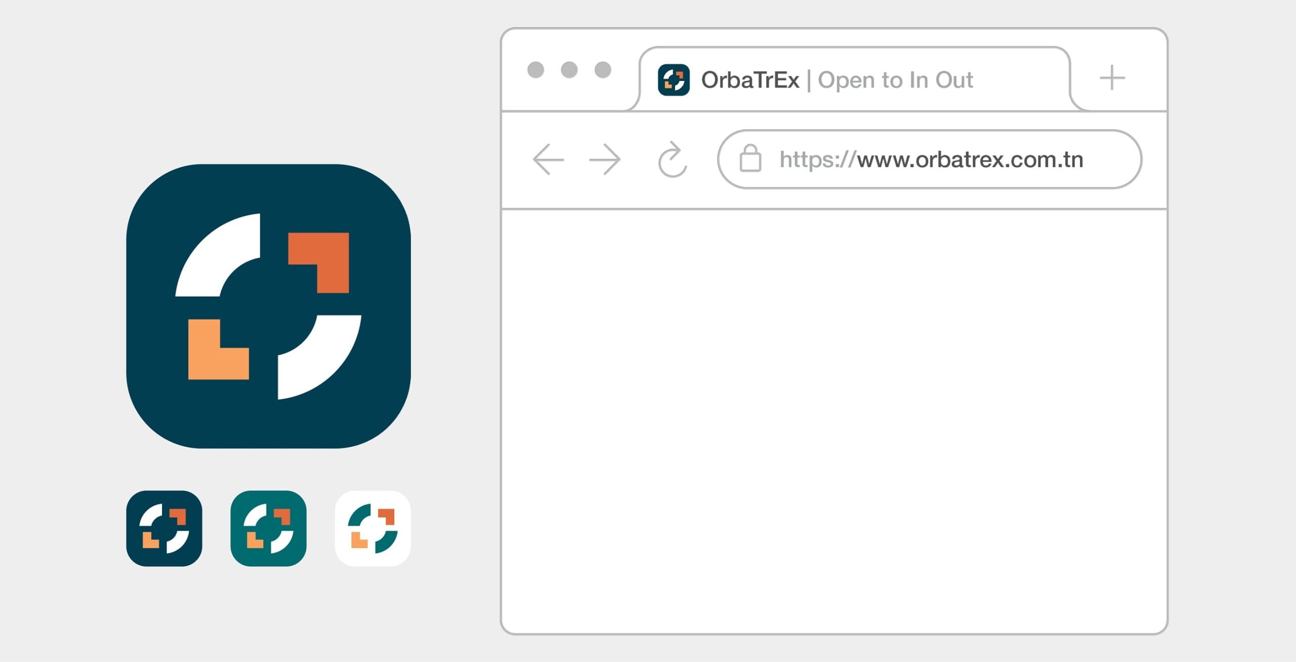
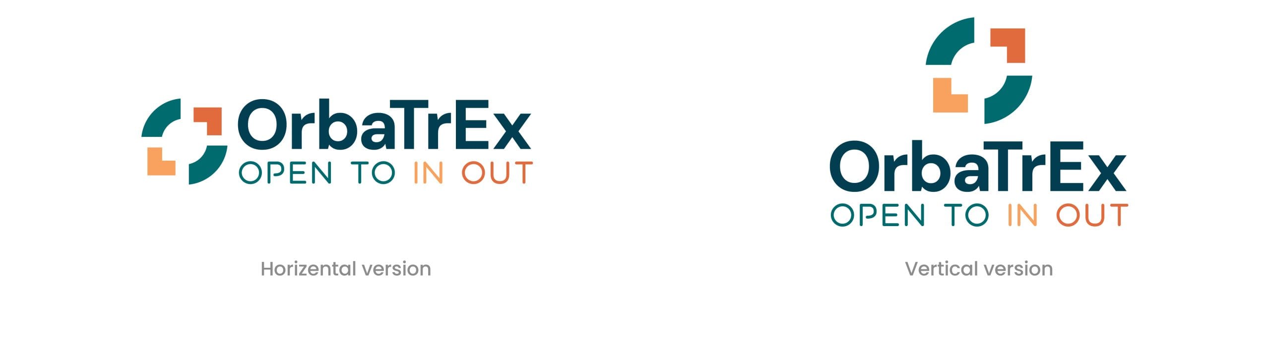
We designed a minimalist identity featuring a dynamic logo with directional geometric lines, symbolizing the fluid flow of international exchange. This visual system was integrated into a professional digital platform that highlights their logistics expertise, positioning OrbaTrEx as a robust partner for global commerce.

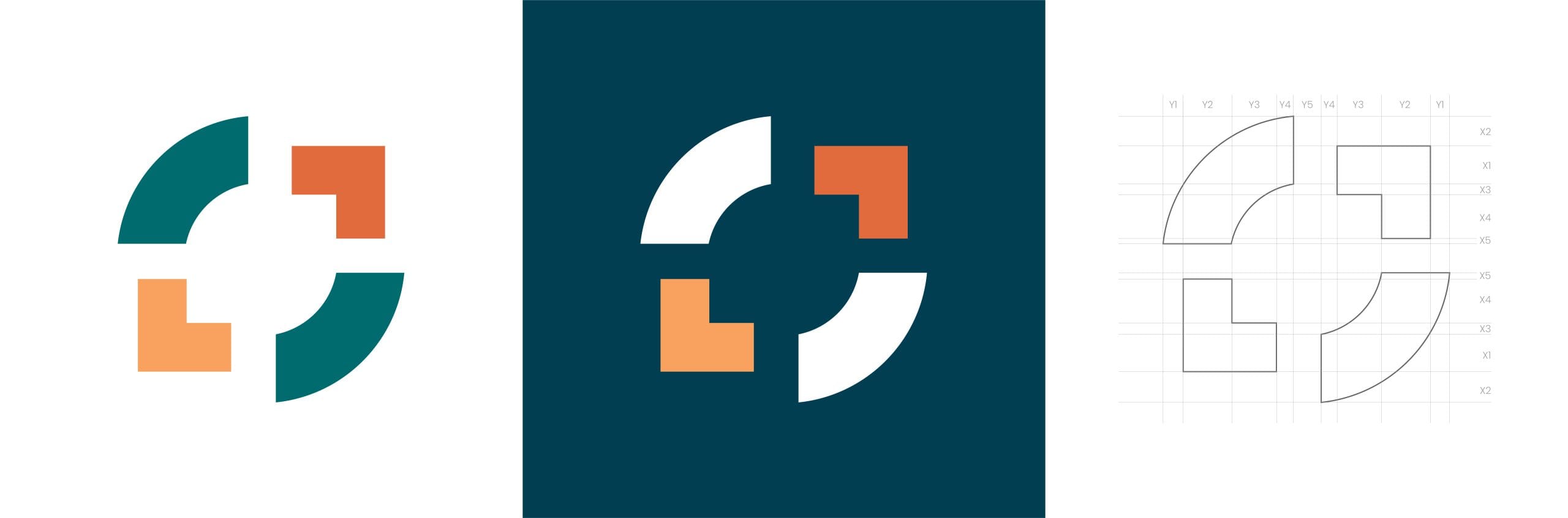
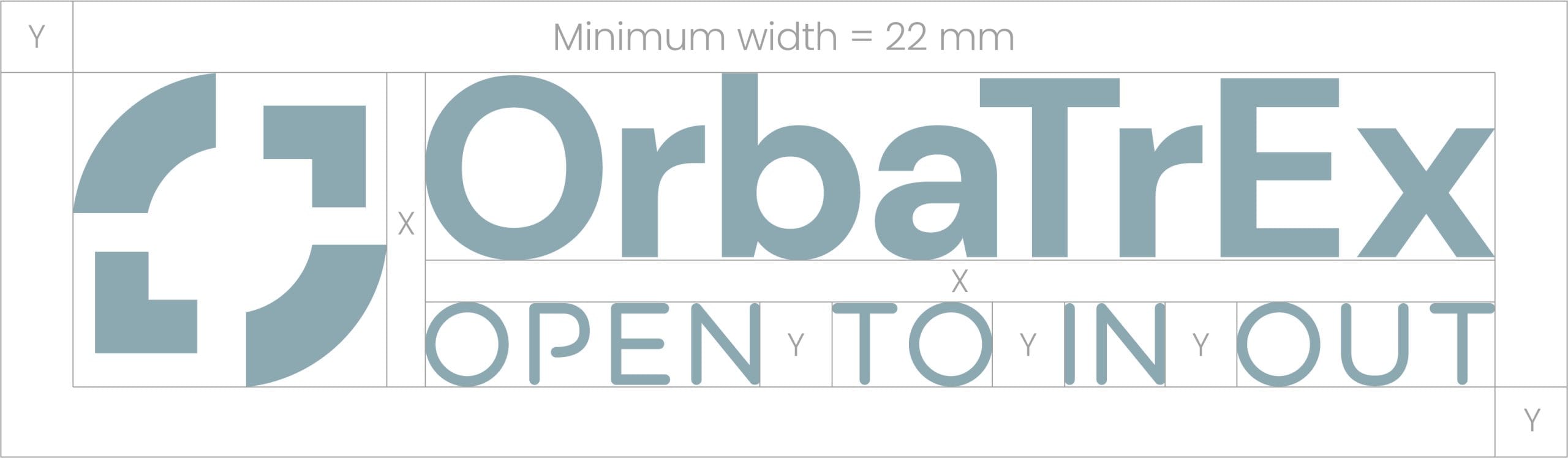
The OrbaTrEx Icon: Anatomy

The In/Out Arrows: The L-shaped elements act as abstracted arrows. Their opposing directions represent the core of the business: Import and Export.
The Central Portal: The negative space creates a “gateway,” positioning OrbaTrEx as the essential hub where local products meet global markets.
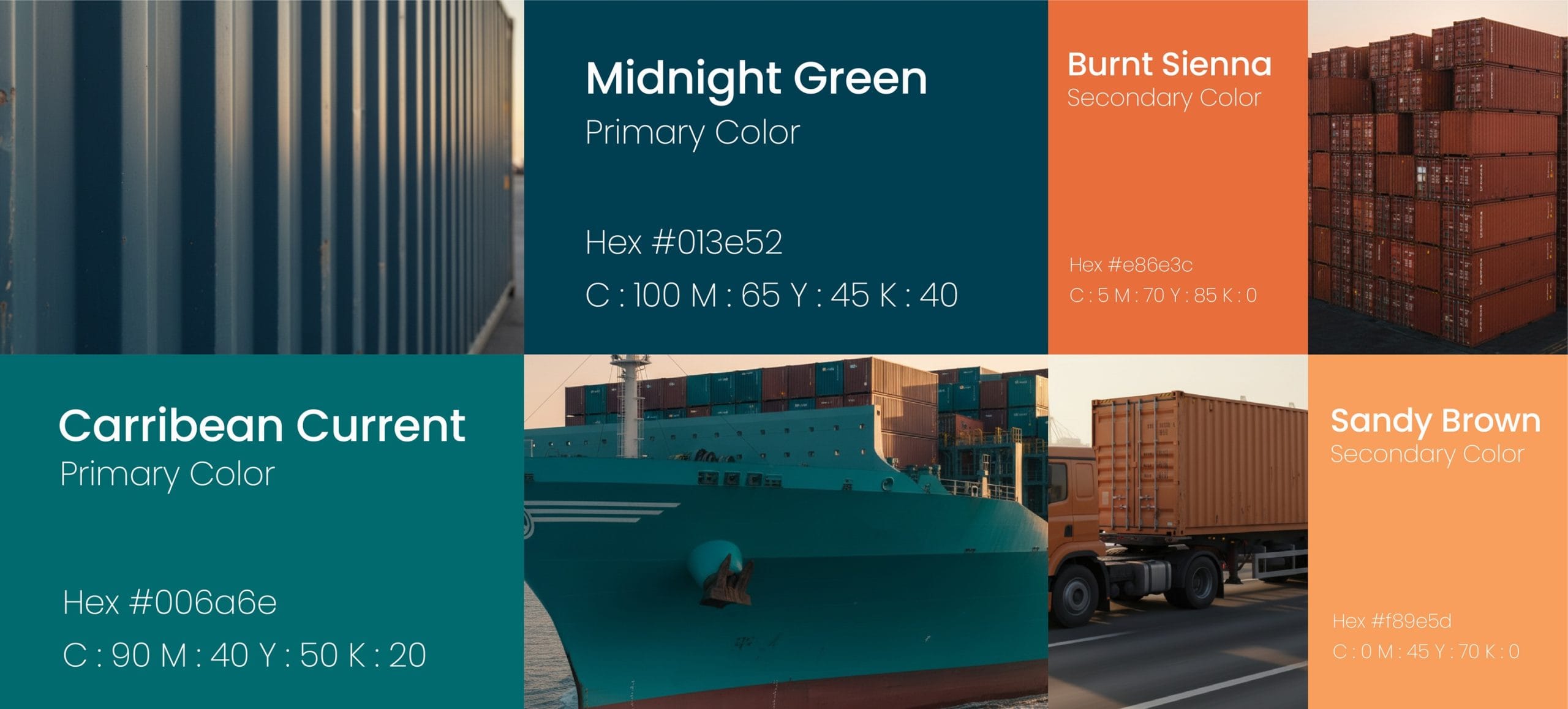
Color Contrast: Teal represents stable logistics, while Terracotta reflects local energy, bridging the gap between Tunisia and the world.


Colors Palette
Typography