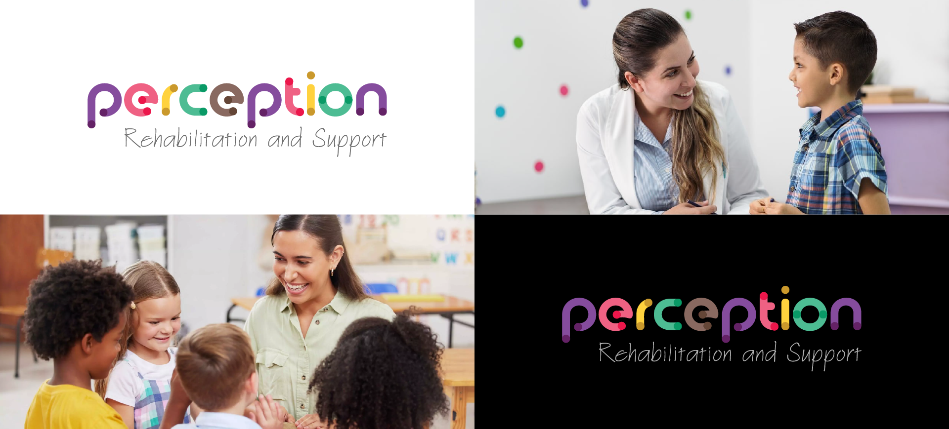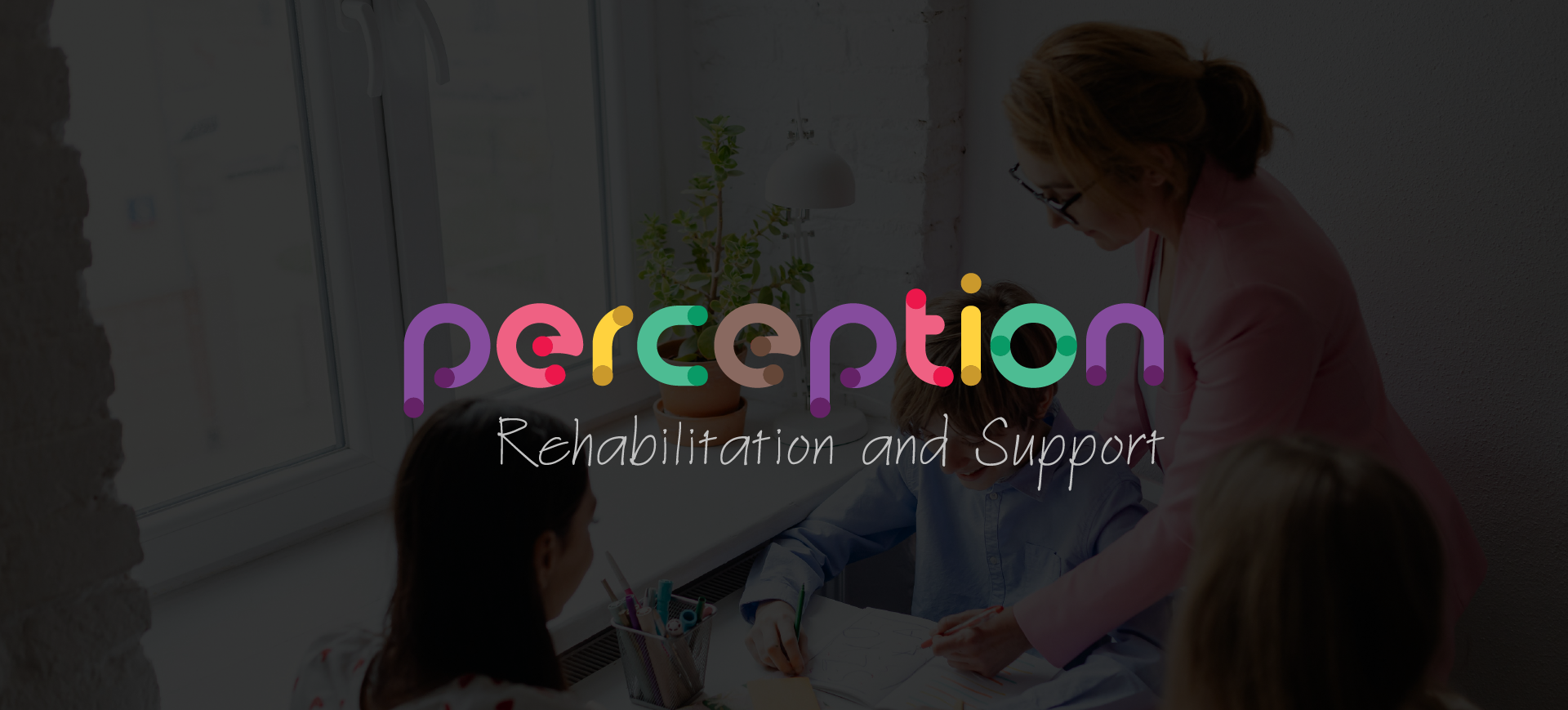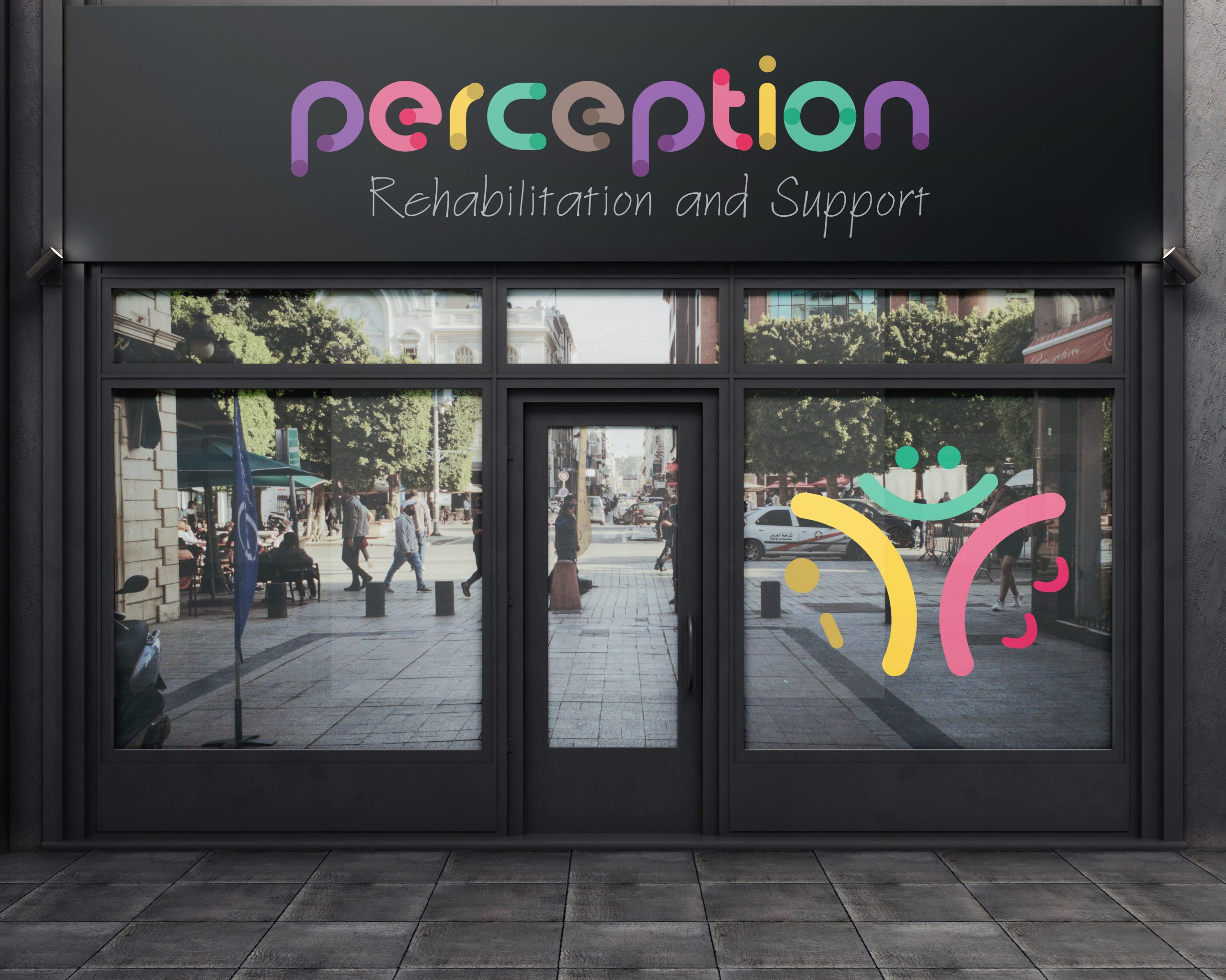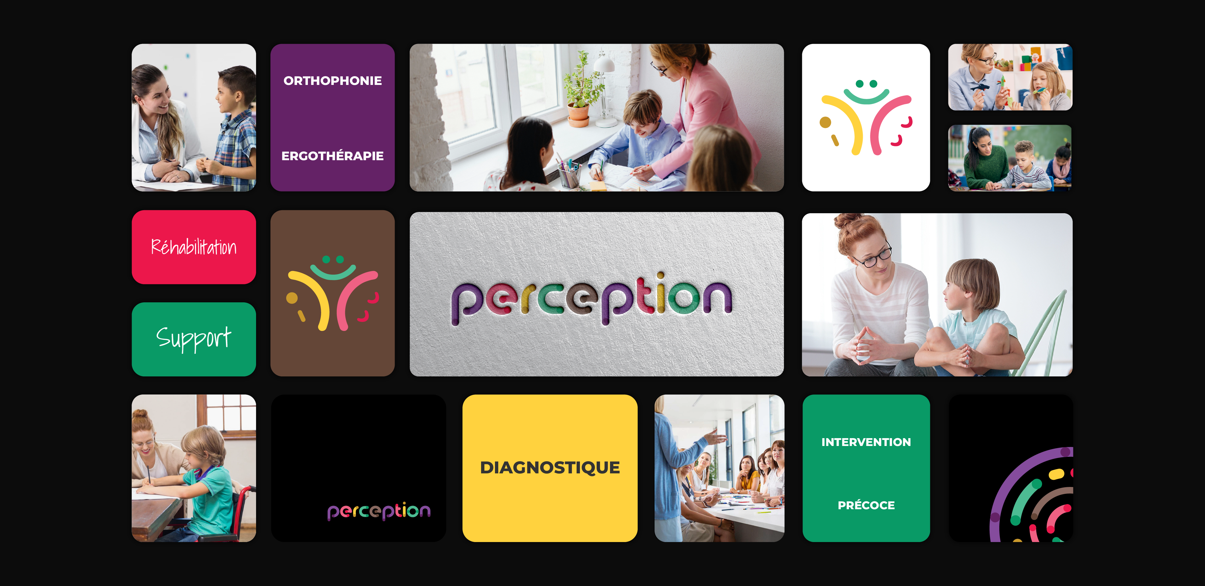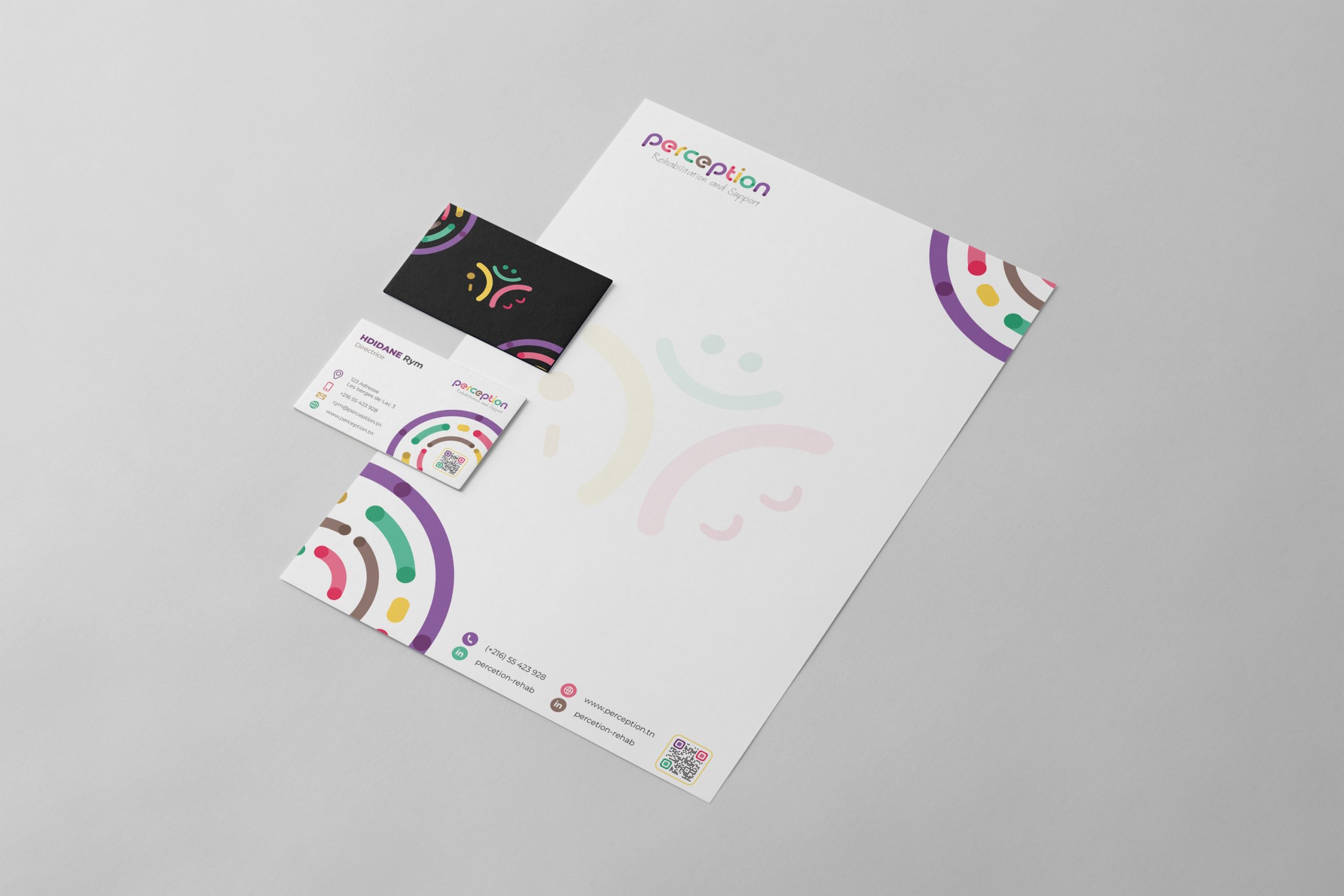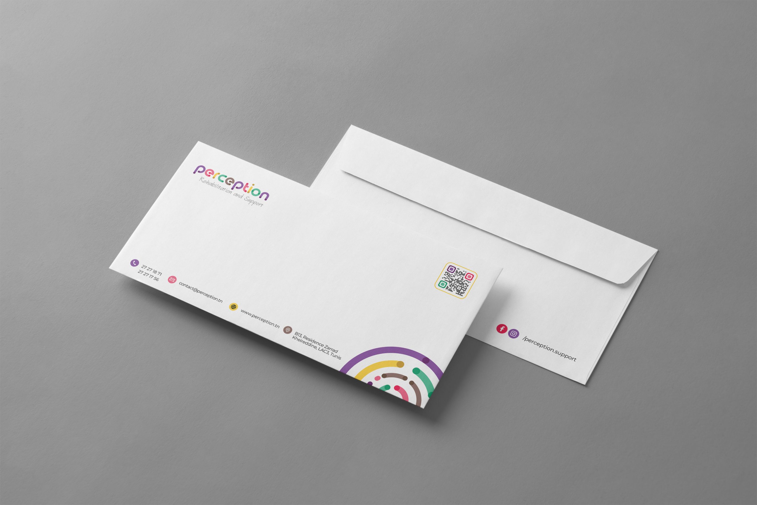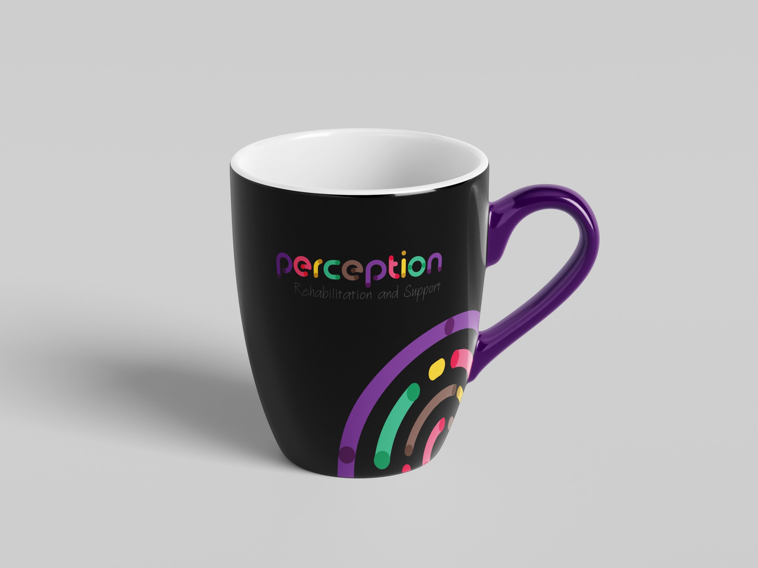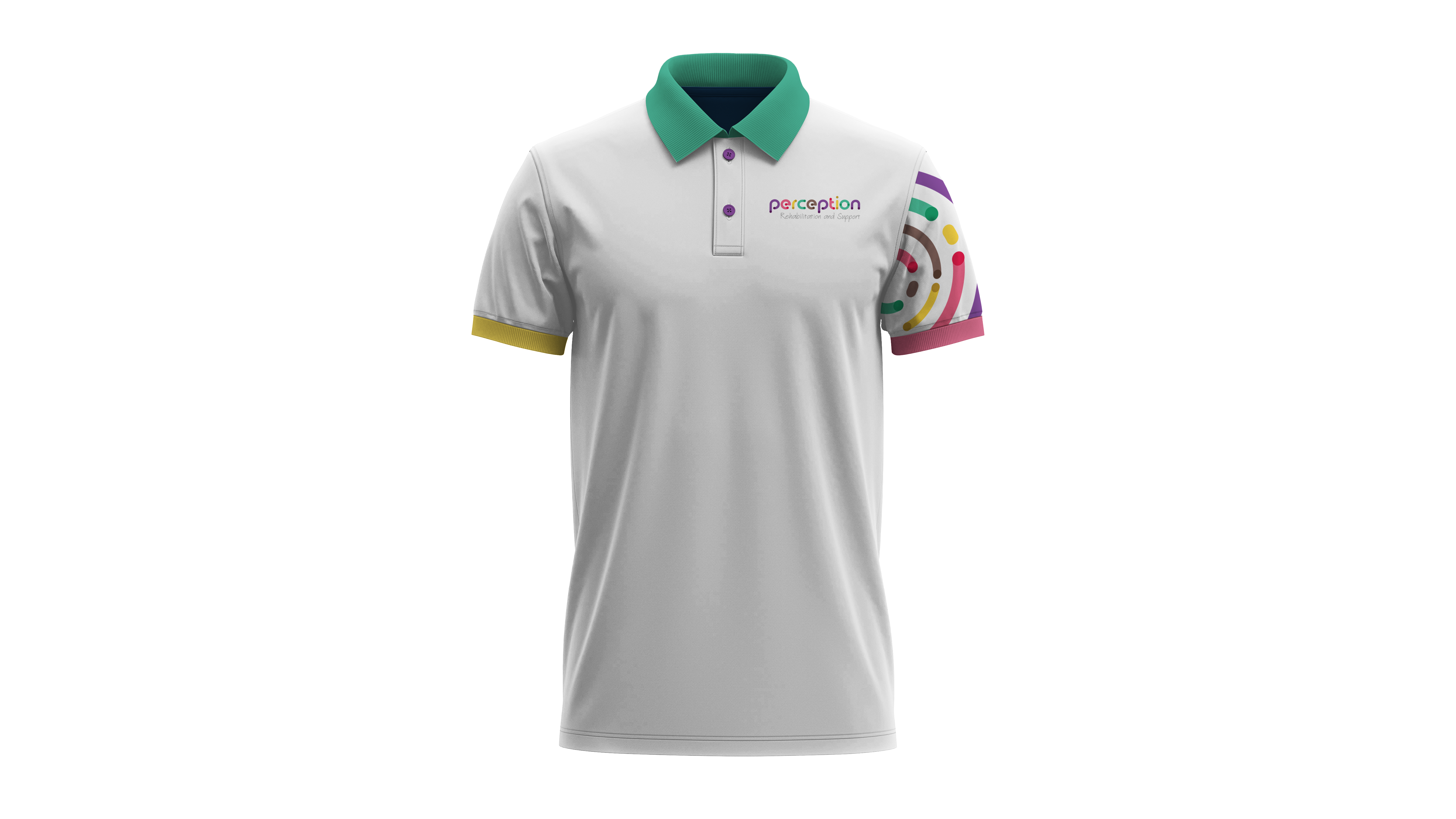
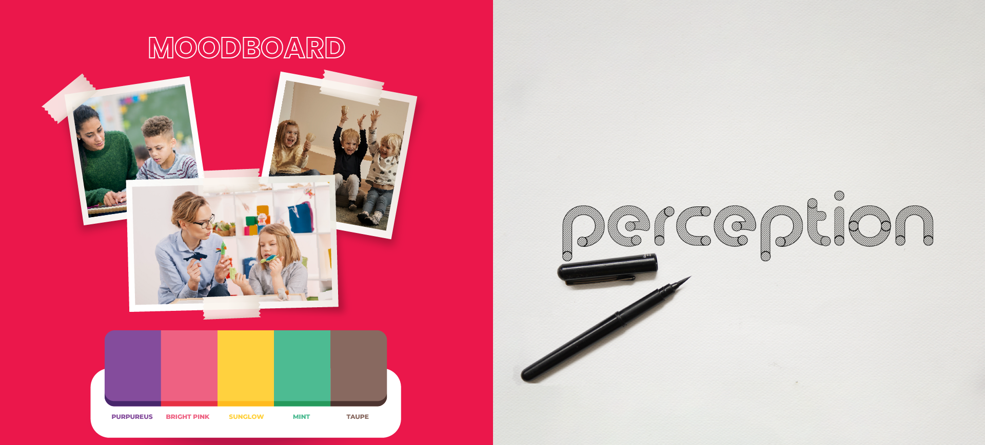
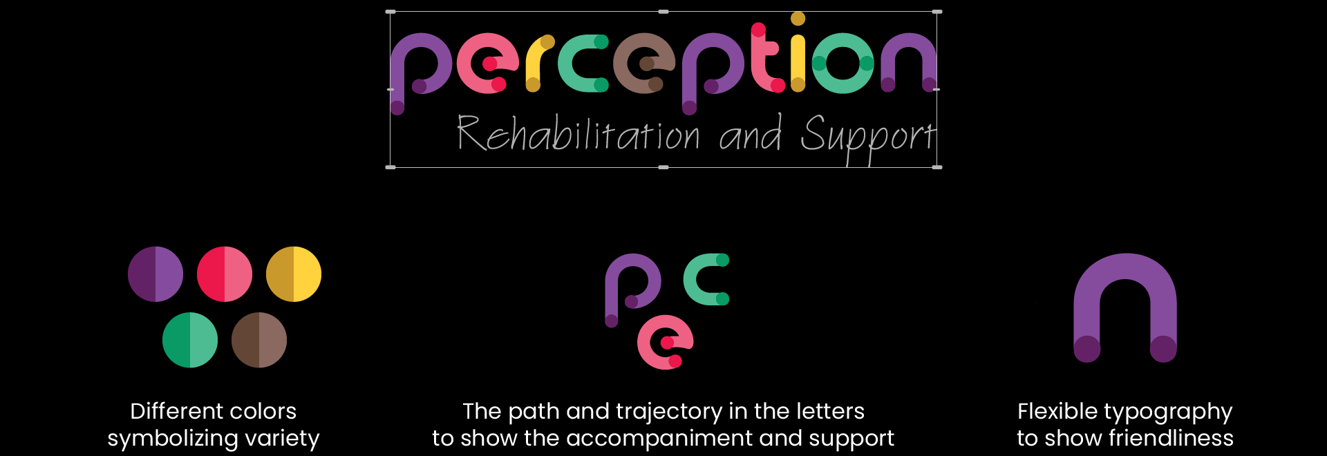
Bookended by intentional dots, the logo signifies PERCEPTION’s commitment to providing comprehensive support throughout each child’s journey. The use of a vibrant, multi-hued color palette reflects the organization’s dedication to serving the diverse needs of its community. Collectively, these design elements come together to create a distinctive, trust-inspiring mark that will serve as the visual cornerstone of the PERCEPTION brand.
NEW